Friday 24 December 2010


I absolutely adore this persons' illustration...and he is stuartkolakovic. And I have no idea why Im blogging about his illustrations commission by M&S for tea on Christmas Day. Its 2 mins pass midnight. Wow dedication much! I can't help but stop and look at this packaging when Im in M&S. I just kinda stand there and go : WOW. I like you so much!.

BASIC CHRISTMAS JUMPERS!


I am feeling a overload for designing this Christmas!! I'm feeling a rush of inspiration during this time of festiveness. Whilst watching the tele last night I couldn't help but think of basic shapes and what I can do with them, so this is what I came up with Hope you like it!!


My sister is currently working in Singapore and sadly not able to join us for Christmas dinner this year!! So i decided to design a poster for her for her Christmas present! LOL.


Tuesday 21 December 2010

Stella Artois Originally Crafted for Christmas 2010 TV ad


I must say that I was totally impressed with this new Stella Artois advert I just seen on the tele. It says that it is beautifully crafted for Christmas and I thought it was REALLy beautifully crafted anyways which is a plus point. It isn't easy coming up with a good solid idea and storyboard. To be fair I haven't really done an advert before but I always have many ideas. Its just me and my never stop thinking brain. I wouldn't mind to be part of a team that creates such a brilliant advert.

Monday 20 December 2010

Little people in big city.

I particularly love this person's work. It is so interesting to see art that are so out of the box. We are so used to seeing so many different types of art like paintings and sculptures but I found his form of media so enjoyable to look at. I could easily keep scrolling through all his pieces of work. These little figures are all hand painted and only less than an inch in size. He did it as an installation and photography project. He wanted people in the city to be more aware of their surroundings and to feel the loneliness you can feel in a big city. He too wanted people to emphatise with the tiny people. He is currently doing another project where he decorates snail's shells and placed them back in their surroundings. I love it so much I might actually buy the book.


slinkachu11slinkachu3

You can check out more of his work here: http://slinkachu.com/

Thursday 16 December 2010

HUGE VASELINE TIN!!

People must think Im dead or something since I haven't been blogging lately. I shall make up for it over Christmas with the extra time I got. :D

My mom bought this as a secret santa gift. and surprise surprise its one BIG VASELINE TIN. Its so super cute. I was hyperventilating when I saw it. I must get it for myself. Whoever thought of this packaging deserves something.

Sunday 5 December 2010

Apple's iHoloPhone


This is probably one of the coolest thing we learn about in lectures. It was on the topic of futurology and the lecturer showed us one of this future perceptions or goals for Apple. I thought this was pretty darn cool. I mean its a bit weird and unimaginable at the moment, the thought of a family member just appearing from your phone. But it just goes to show how much we have advanced in technology. Nothing ever seems impossible now a days.

Monday 29 November 2010

We were asked to bring in our cv for tomorrow. Wow what short notice. Just thinking how everything we do have to clearly be designed, or rather we should WANT to design everything. So there I went looking for inspiration and look what I found. I stumbled upon many well designed cv, well in my terms that is. But some are so striking that you will definitely notice it once you picked it up. I guess that is the whole point of it all. If you have a well designed cv, obviously you are well and capable of designing well. Wow thats a full on sentence there.


Sunday 28 November 2010

CHOCO ME.

Chocolate is kinda on everyone's list for christmas..whether on a present list or eating list. Everyone loves chocolates. But I don't really eat that much chocolate but I do love to look out for some really interesting chocolate packaging. Im making myself hungry now, probably not the best idea in the world to be blogging about this at such a time-->1.15am. Typography seems to be dominating the design world at the moment. I have been noticing it in brochures, billboards, prospectus and many other forms of media. There seem to be this trend and I am not too sure what my views are on it but I would definitely say that it is kinda boring me at the moment and would really like to see the more detail. But nonetheless, still pretty engaging if done with the right copy.

999021242075784


904661230698778.jpg


foil by gabriel morales


co couture chocolate packaging


Thursday 25 November 2010

FROM YOUR BEHIND

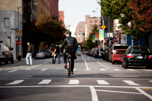
A coursemate of mine just shared a link to this person's tumblr and it made me wanna blog about it. Check it out: http://downtownfrombehind.tumblr.com/

I think it is so interesting to have a different perspective of downtown and especially when it is as good as taking people on their bike from behind. What could possibly be more visually interesting that this. I have always wanted to do something along the lines of this. My idea is to take a collection of people's shoes. Maybe I will do it sometime soon, but I can't help thinking if anyone would actually allow me to take pictures of their shoes.

tumblr_lbsblhnUcv1qbh9lq.jpg


Sunday 21 November 2010

THE JOY OF CHRISTMAS FOR A GRAPHIC DESIGNER.

CHRISTMAS is coming round the corner pretty soon!!!. What have I being doing this entire year?? Has a year gone by just like that? Studying Graphic Design has taught my brain to go into auto mode of analysing whenever I see something to do with graphic design or anything that interest me really. It really does get in your head, so much so even when I was contemplating how I should do my christmas cards or let alone do any, I wanted to design it. So, where does a graphic designer get hisinspiration from? Google I say. Unless someone can correct me. Well so I started Googling...came up with a pretty simple one but here are the other eye-catching designs i stumbled upon.

Thursday 18 November 2010

KEEP IT SIMPLE STUPID.

Sometimes with some project briefs, you land yourself into this deep grave that you dug for yourself because you have been thinking toomuch for ideas for a concept let alone a concept itself. I wish there was an easier way but sadly there isn't.

The way that I find inspiration lately, is through my best friend google, wikipedia, theasurus.com. Its amazing what these guys can do for you, they stir up the sea so you can brainstorm. And english is so important in a graphic designers
life. A poster itself is 100% good design and 100% copywriting. Im sitting here w
ondering how other foreign countries with different languages do copywriting when so much of it is rhyming, witty play on words and idioms. Or do I have to learn to broaden my way of thinking?

Maybe it is just purely procrastination that messes with your head, so you can't think creatively sometimes.

Monday 15 November 2010

THE FUTURE OF LIGHTS.


A friend of mine shared a link with me about Derby's building being turned into art works using light. People who know I do graphic design seem to feed me with anything to do with design, which I find pretty amusing. I have never really thought about lights being used in this way and it inspires a lot. Even if you do not like art, I'm sure you will love the art light displayed in Derby. Its amazing! The way they play with the architecture of the building and creating moving images that interact with the architecture. One of my favourites in the video was the one where the building seem to collapse like a sheet of fabric. Artists are constantly finding new ways of engaging the public and I believe that this will be the way forward to many things to come!! The future of movies maybe?!

Sunday 14 November 2010

VINTAGE PACKAGING vs MODERN PACKAGING


Just thinking about packaging and how it has evolved over the many years. It has changed to suit the environment it is displayed in and that the materials used has to be carefully considered. Things like environmental issues and recycling. All these factors have affected but yet challenged to many different types of packaging today. Looking at vintage packaging, it is pretty interesting to see their style of designing and the materials used. I feel that design used to be more aesthetically viewed, whereas, in todays day and age, design has to incorporate branding, packaging and after life of the product. It all has to integrate to add value to a particular product. It is a harsh world with lots of competition out there and it all depends on the hands of us designers to make it that much more "OOMPH".

Friday 12 November 2010

A REVAMP OF THE STUDENT COMMON ROOM

My idea for the Student common room would be that it looks more like a studio with work displayed, form textile patterns to graphic design work and fashion sketches, ( maybe with a collection of really old books too). This will provide a stimulating and inspiration area for students to hang out in. On top of that, with the comfy sofas and preferably a wooden coffee table, it will give it more of a cosy homely feel. Not forgetting, we could do with kettles for a cup of tea or a mug of coffee :). I also added the thought of putting high wooden tables so people can use that area to do their work. By painting the spiral staircase at the corner, it gives that extra touch of interest and a splash of colour. Most items are easily found even if it is not from Ikea. But if budget is tight, Ikea is the way to go.

Wednesday 10 November 2010

Spoon + Nachos = Spoonachos


This product just reminds me of my current project that I am doing. We are suppose to add value to an everyday item and I got the product of sugar. Well enough of sugar for now and back to Spoonachos. How smart can anyone get in designing something so simple yet innovative. I just wonder how long it took this personto come up with this idea, as long as any of us in my course? And to think of the ending letter of spoon, ends nicely with an 'n' in order for it to link with the word nachos. He's got it good.


Monday 8 November 2010

A billboard that cries blood


This billboard was installed to emphasise the important of driving under safe conditions in rainy conditions. Whilst I was doing my research on billboards and adverts, I came across this and it really had an impact on me. It is such an effective advertand one that is so creatively, intelligently designed. In normal weather conditions, the boy appears to be normal. But when it rains, blood flowsout of him.

Sunday 7 November 2010

A beer bottle fetish?


I have this thing for beer bottles. When I am out for drinks and the guys get a beer, I always almost want to keep their beer bottles. There is just something about how each beer label is represented. It kinda gives an identity to the person drinking that particular brand as well. People who drink Budweiser, would say : '' Im definitely a Budweiser guy'' or '' Guinness is a proper guy's drink'' or ''it's got to be Stella Artois''. I do not like the taste of beer but rather prefer the label and appearance of it. One day, I hope to build up a whole collection of beer bottles that takes my fancy. For the pass however long, it has been Stella Artois for me. Currently have an empty bottle of it displayed on my shelf.

Googled it and found some really interesting advertisement posters for it.

Friday 5 November 2010

Don't confuse Marc John with Marc jacobs.


Check this website out! I love Marc John's work. He just has such a peculiar sense of humour and cute ideas. I wonder where he gets his ins
piration from. I wonder what makes him sit and paint such random but interesting images. I love the fact he uses watercolour in his work as it just gives that subtleness that makes it all the more successful.
I have recently been doing this little project of mine where I would draw a random thing a day. It is in an album in Facebook, called "Each day i
s random". It is not easy at all to think of something to draw and to add that substance to it as well. So I take my hats off to you, Marc. I would not mind having his designs as part of my wallpaper, that is how much I love his designs. If only he could draw one for me personally.

Here is just one of my pictures from my random album:

Wednesday 3 November 2010

Hat's off to designs like this.


The Dieline Blog has got to be the one of my top favourite websites to browse through. Whether for inspiration or just purely to satisfy my need of good graphics. Some of the ideas are amazing and others just simply aesthetically beautiful. The picture above of the Penhaligon's Christmas Gift collection shows great illustration skills and use of colours. Designers seem to be using a wider variety and mix of colours for different occasions, and in this case, Christmas. No longer is it the norm of red, green and white and the occasional splash of gold. Designers are all gearing away from the norm and that excites me a lot. Seeing this christmas collection, it really strikes me to think that quite a lot of my course mates are all displaying and coming up with sleek, simple ideas and to be really honest, we should not be. Emphasising on the ''we''- I should expand my ideas and skills. Especially for packaging, there is an element where you can be fun with it too. Lecturers seem to prefer the sleek, no fuss kind of designs. Its boring.

My take on the future: to be a packaging designer!! Will see how it turns out like :D I might put up my packaging from my current brief soon!